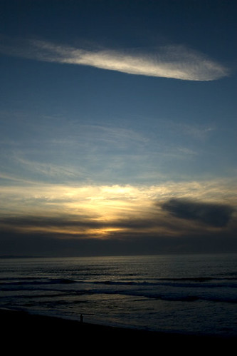
ISO 100, 31mm, f/4.5, 1/1000 sec
I have a couple questions. Is this too dark? What would you change about it to make it a "sellable" photo? Personally if I were to do some Photoshop work on it I may try and highlight the light on the water a little more but I like the dark lower area and the one lone person silhouetted gives it some scale for me. Any thoughts?

5 comments:
Add my own comment to point out to myself that I didn't get a straight horizon line...
It's nice, but as you said, it is a bit dark on the bottom. I have the same problem when taking photos of sunsets. They are always over exposed on top or under exposed on the bottom.
As for photoshop, maybe a mask for the bottom half to bring up the exposure? Something like this: http://www.nickgallery.com/web_pages/technical%2013.htm but copy your photo, increase the exposure and then use the technique with the two photos?
Great shot btw..
Besides the horizon line that you point out, its perfect!
The darkness adds to the 'pop' of the light. Its lovely.
The figure adds to the sense of scale. Its hard the get skies like this to look so immense and match what you see in reality, and I think you achieved the sense of epic beautifully!
Thanks for the feedback...I really appreciate it.
My eyes are drawn to the highlighted cloud. Definite positive focal point for the image.
This may be an image to try some HDR work in Photoshop. Expose for the sky and the beach and composite the photos in post.
Post a Comment