Sunday, March 21, 2010

Diptych


reaching for the sun, originally uploaded by Rob Weiher.
I've been wanting to try doing more creative post work for a long time and have finally gotten around to playing with diptychs.

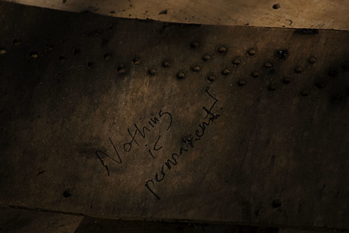
What is a diptych? It's a photograph that uses two different or identical images side by side to form one single artistic statement. The two images can literally be in contact with each other, or separated by a border or frame. It isn't limited to photographs and has been used for centuries in other art forms.

I have a few people I'm using as inspiration on these and have lots to learn. It's not limited to using the same scene or even colors. As you can see in the top image I just used two shots of the same scene. The one below I wanted to see how two different shots with the same basic theme (waterdrops) would look together. Not exactly sure how I feel about it yet.

Sunday, March 14, 2010

Nothing is permanent


nothing is permanent, originally uploaded by Rob Weiher.

An old piano a former student at the university bought and put out in the woods as a project and has stood for a number of years was recently destroyed. The piano wasn't just sitting there...he took it apart and put it back together around a tree so the tree was growing up out of the piano.

I had heard about the piano and had seen pictures of it and had wanted to search it out a number of times but never did, today I went in search of it only to find that it destroyed. This I'm pretty sure was a recent occurrence as a video made in November shows it intact.


 It really deflated me when I turned a corner and saw a pile of wood on the ground. I had been envisioning this piano in the tree for quite some time and was coming up with different ways to photograph it in my head. I guess what this has taught me is to not wait around and when you want to try something you better find a way to do it sooner than later. As the vandals (I'm assuming here) points out....nothing is permanent. 

Here's a video of the piano and an interview with the artist who came up with the idea. Wonder if he knows yet that someone destroyed it rather than it going back to the earth as he intended.

Wednesday, March 3, 2010

White Crane


white crane in b&w, originally uploaded by Rob Weiher.
If you're a regular to my site you'll notice a bit of a change. I've been wanting to change the template for a while now because I didn't like how the old one limited the size of my photos so much. I'm still playing around with the template and will probably change the orange to something less orangey.

This shot was taken a while back and while cleaning up my 365 archive I wanted to see if I could take it from being a blown out throw away photo to something more appealing. After converting it to black and white and cropping to remove excess tree branches I started to see it come together.

- Converted using the black and white adjustment layer (neutral density preset).
- Used a new technique I just learned that uses the Hue/Saturation adjustment layer. Create a Hue/Saturation layer and change blend mode to Color. Create another Hue/Saturation layer and move the Saturation slider all the way to the left. Switch back to the other Hue/Saturation layer and adjust the sliders as needed.
- For extra contrast added a Curves layers and used the Increase Contrast preset.
- Did a little dodge and burn on the bird where needed.

Monday, March 1, 2010

Los Laureles Grade (Carmel Valley)

Los Laureles Grade in b&w, originally uploaded by Rob Weiher.

Saturday was a stormy day but only in certain areas so while out I went in search of areas with big fluffy storm clouds yet not raining. My hope was to really work on seeing in black and white since my new style interest has been black and white. Something about the "feel" of a good black and white photo gives me a warm fuzzy.

So here is a landscape I shot with black and white in mind. I'm also playing around with a few different conversion techniques in Photoshop in lieu of buying additional software like Nik Software's Silver Efex Pro.

I also cropped this to be more of a pan. The immediate foreground was nothing special and took some plain clouds out at the top. My plan is to create a large white border with extra at the bottom and title it and have it printed out as a 11x14 to see how it looks.

Excuse the mess

The small compact post area has been bugging me for a while now so am playing with other templates. I like this one but need to reconfigure a few things so in the meantime please excuse the mess.